 "
"
Woffice 6.1.0 Version: New Celestial Skin Added!


An Overview
The Woffice Celestial Skin is here! Experience the all-new design enhancements that make customizing your intranet easier than ever. Update colors, buttons, typography, and logos all in one place, saving time while ensuring a sleek, consistent look.
We’ve detailed the improvements below with a side-by-side comparison to our Themeforest v5 Classic Skin. Explore the upgrades to know what’s different to improve your overall experience!
We’re excited to announce Woffice v6.1.0, packed with significant updates for those who love customizing and fine-tuning their intranet designs!
The highlight of this release is the all-new Celestial Skin, coming with a MODERN interface.
Let’s see it in action!
Woffice Celestial Skin v6 V/S Themeforest Classic Skin v5
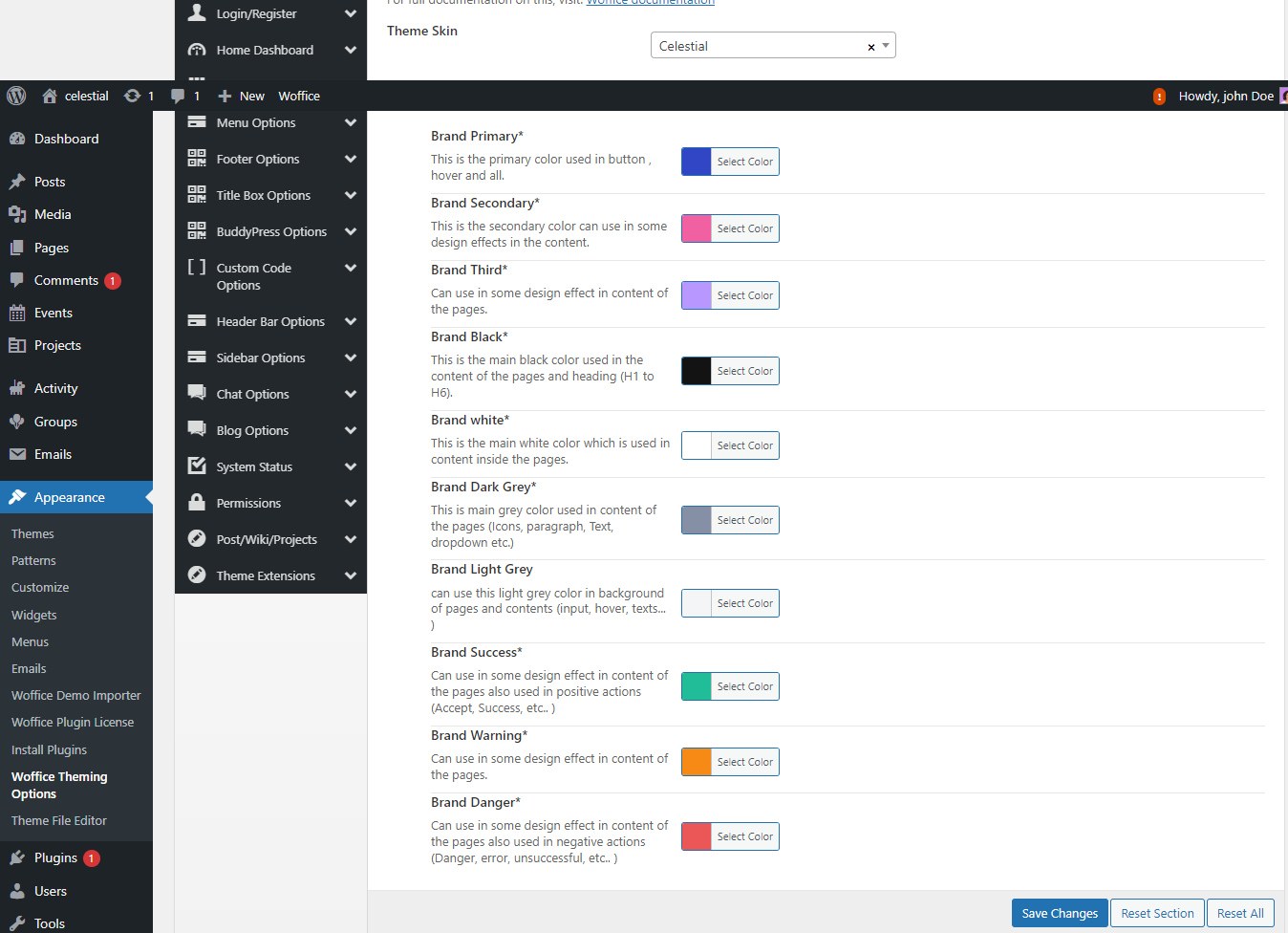
Expanded Color Palette
Color is a key part of your business branding. It also communicates important messages to users on your site. That’s why color selection should always be planned and tested carefully.
After mastering color theory and design principles, our expert designers have created 10 stunning color options for your theme in the Celestial Skin. These choices are carefully curated to enhance your design and make your site look amazing.
In our Classic Skin, you get 5 color options. While these are good, they can limit your creativity and how you express your brand.
More color options mean you can create a more unique and engaging design that stands out and better communicates your message. The Celestial Skin offers a broader palette for your branding requirements.
Added Collapse Menu Logo
Digital marketing demands that brands stay dynamic and adaptable. A traditional logo can feel static and may not evolve easily with your growing business or adapt to different online platforms.
With our Celestial Skin, you can now add a collapse menu logo. This feature allows your logo to remain visible and adaptable across various devices and screen sizes.
With our Celestial Skin, you can now add a collapse menu logo. This feature allows your logo to shrink to a smaller size on click, saving space and keeping your design clean. This way, your logo remains visible and adaptable across devices while evolving with your business.
![]()
Go to the Header Bar Options in the Dashboard, where you’ll find the option for the Collapse menu logo.

It ensures consistent visibility of your brand even when the menu is collapsed. It also adds to the overall professionalism of the site by ensuring the design remains cohesive, whether the menu is open or collapsed.

In comparison, the classic skin does not display a collapsed menu logo—when the menu collapses, the logo is completely hidden, as shown in the screenshot above.
The newer option keeps the logo visible, boosting brand presence and user experience, unlike the classic skin where it’s hidden.
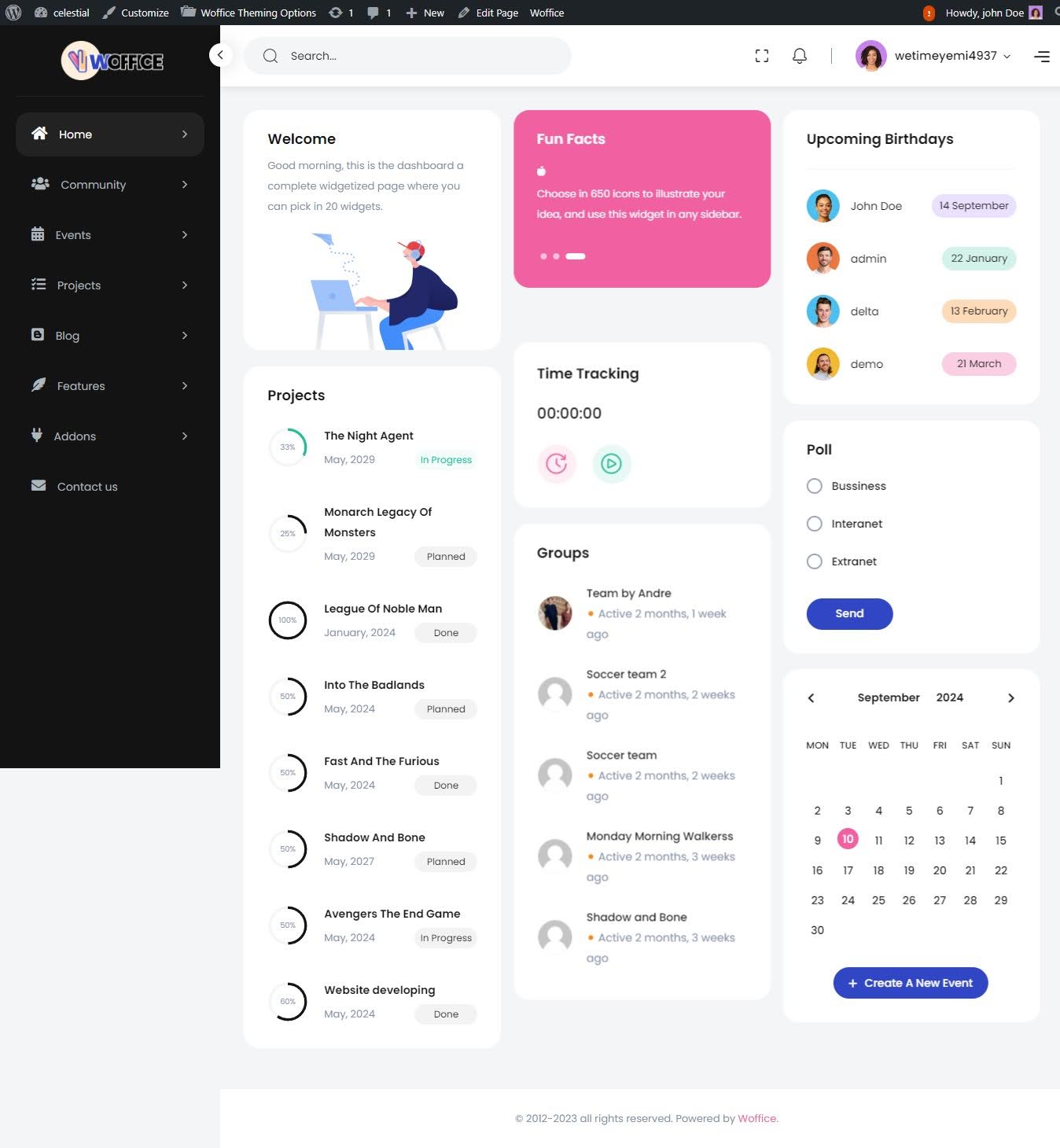
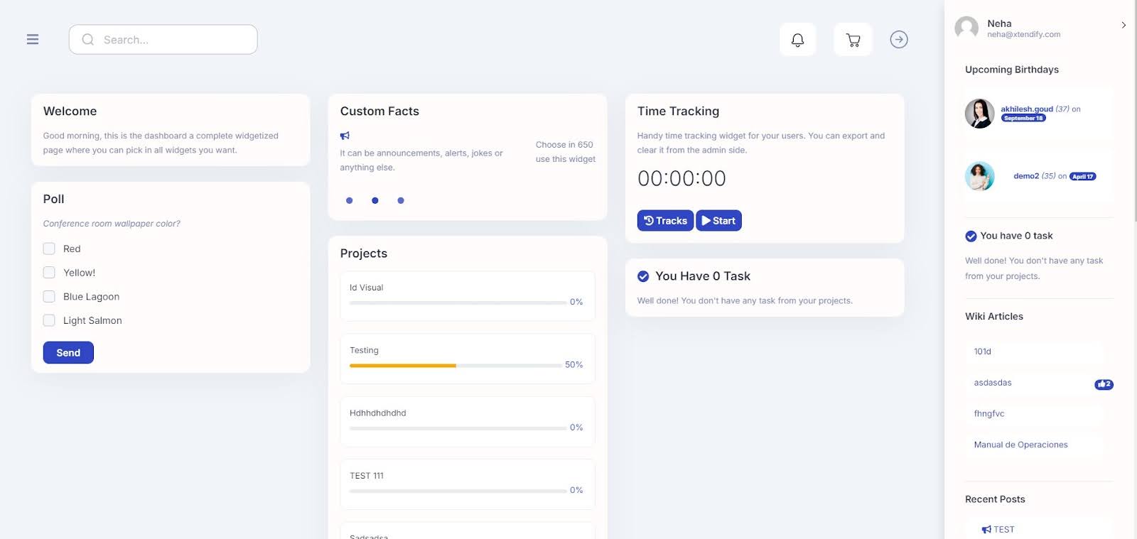
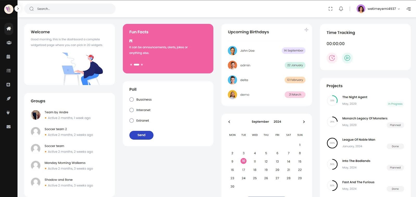
Redesigned Frontend Dashboard
In the Celestial skin, we’ve completely redesigned the frontend dashboard. This involved reviewing the theme’s current design and identifying areas that could be improved for a better user experience.
We aimed to make your navigation smoother and more intuitive. It ensures users can easily access what they need.
On the contrary, you can check that classic skin features an outdated design that lacks the modern, user-friendly elements of the Celestial skin. Doesn’t it feel less responsive now?
Redesigned All Widgets
Website widgets enhance performance and user engagement by offering interactive elements like comment boxes and live chat, which encourage direct interaction.
They also allow for personalization. They adapt to individual user preferences for a more tailored browsing experience.
In our latest theme update, we have redesigned all widget designs to align with the new skin, enhancing functionality and aesthetics.
NOW, take a look at the dashboard of the Classic skin below! The widgets in the Classic Skin appear more rigid and lack the refined polish seen in modern UI designs. They may feel clunky.
Spacing and alignment in the Classic Skin can sometimes appear cluttered or less harmonious as compared to Celestial Skin. The design may feel more intense or outdated, lacking the soft, neutral tones that enhance readability and user comfort.
Full-Screen Mode
Fullscreen mode makes an app or webpage take up the entire screen, removing toolbars and borders. It offers a distraction-free, immersive experience for users to focus on the content.
Another benefit of fullscreen mode is increased productivity. Users are less likely to be distracted by other apps or notifications, allowing better focus. This aligns with our intranet/extranet WordPress theme’s goal of enhancing productivity.
The full-screen mode was missing in our classic skin. Without this feature, users had more cluttered screens, impacting focus and productivity. This limitation made it harder to create the efficient experience we aim for with our project management software.
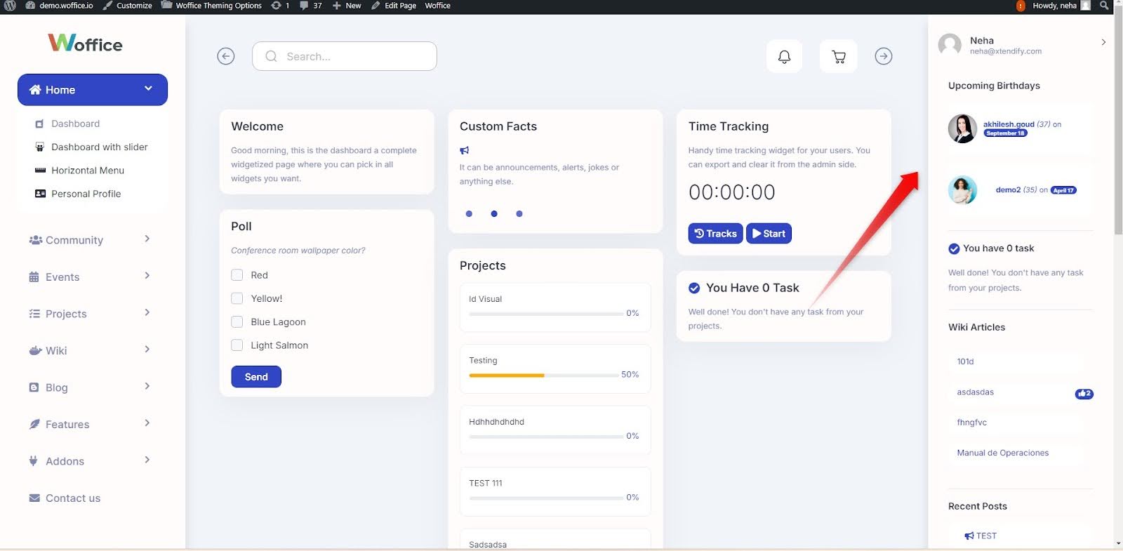
Profile Icon Submenu Redesign
In the new skin, the profile menu icon is now conveniently placed at the top, making it instantly visible when BuddyPress is installed and activated. This streamlined placement improves user navigation by providing quick access to the profile without additional steps.
![]()
In contrast, the Classic skin required users to open the sidebar to locate the profile menu. This added step created unnecessary friction, slowing down the process and making it less intuitive.
![]()
Overlap Sidebar Visibility
With our new Celestial skin, the sidebar experience is much smoother. A simple click on the three bars brings it into view, overlapping the screen in a fluid transition. This design is more intuitive and enhances ease of use with a quick, seamless access.
In the Classic skin, the sidebar would hide after clicking the arrow, making it feel a bit clunky and less accessible. Users had to keep toggling it back and forth, which interrupted the navigation flow.
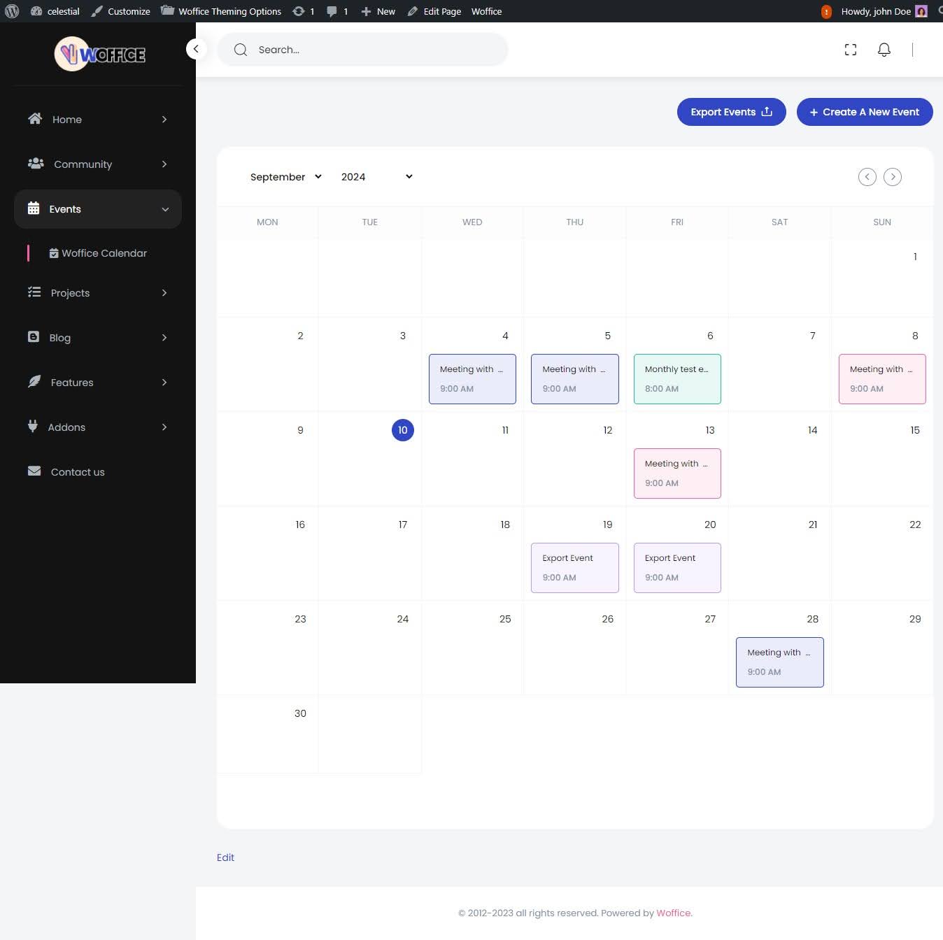
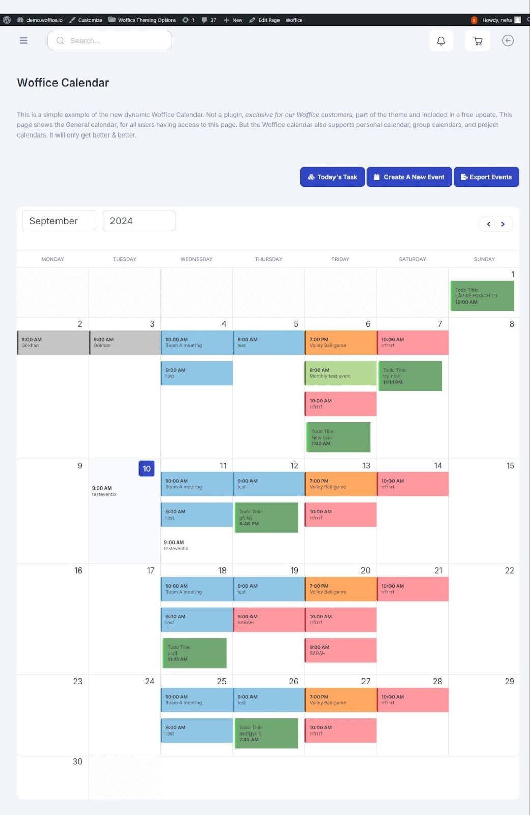
Events Color Update
Think about a greeting card with warm colors that made you smile. Now, imagine a website where the colors were so inviting you wanted to explore more about the business.
On the flip side, you’ve likely seen websites or apps with cluttered information and jarring colors that made you want to leave immediately. It’s not just you—everyone reacts to the visual design of both physical and digital products, and much of that comes down to color choices.
With Celestial, we’ve made a major upgrade. The new color palette is carefully crafted by design professionals, giving it a sleek, modern feel. The colors are softer and more balanced, making the interface easier on the eyes.
NOW, check the Classic version! In the Classic skin, the color scheme tends to be darker, which can sometimes feel heavy or dated.
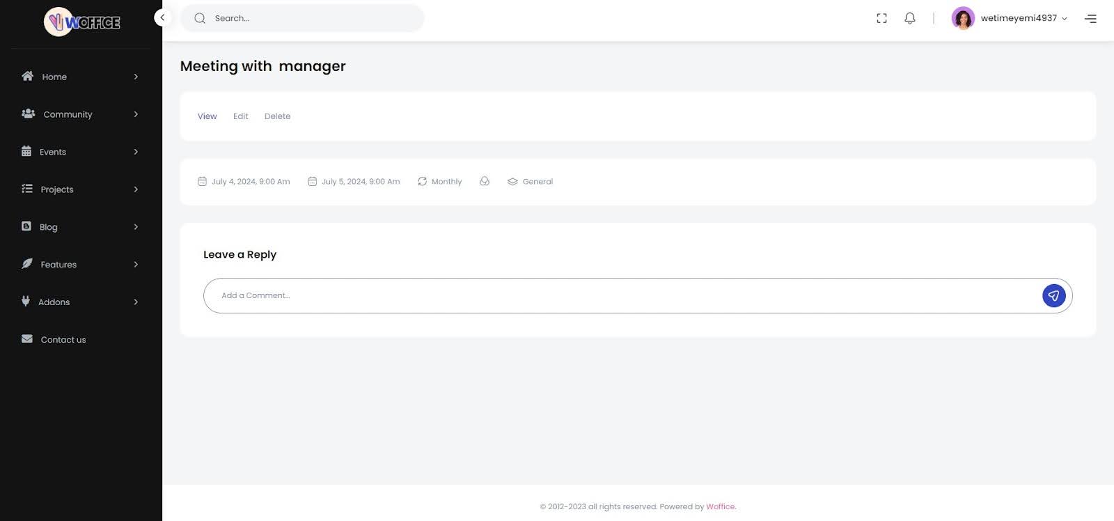
Revamped Event Page
We’ve redesigned the Events page to offer a cleaner, more modern look. The fresh new design is not only visually appealing but also functional. You’ll appreciate the improved layout and aesthetics that make the event page stand out and offer a better overall experience.
Check out the side-by-side comparison to see the difference for yourself! The tabs seem to be too big to be noticed in contrary to the latest Celestial Skin.
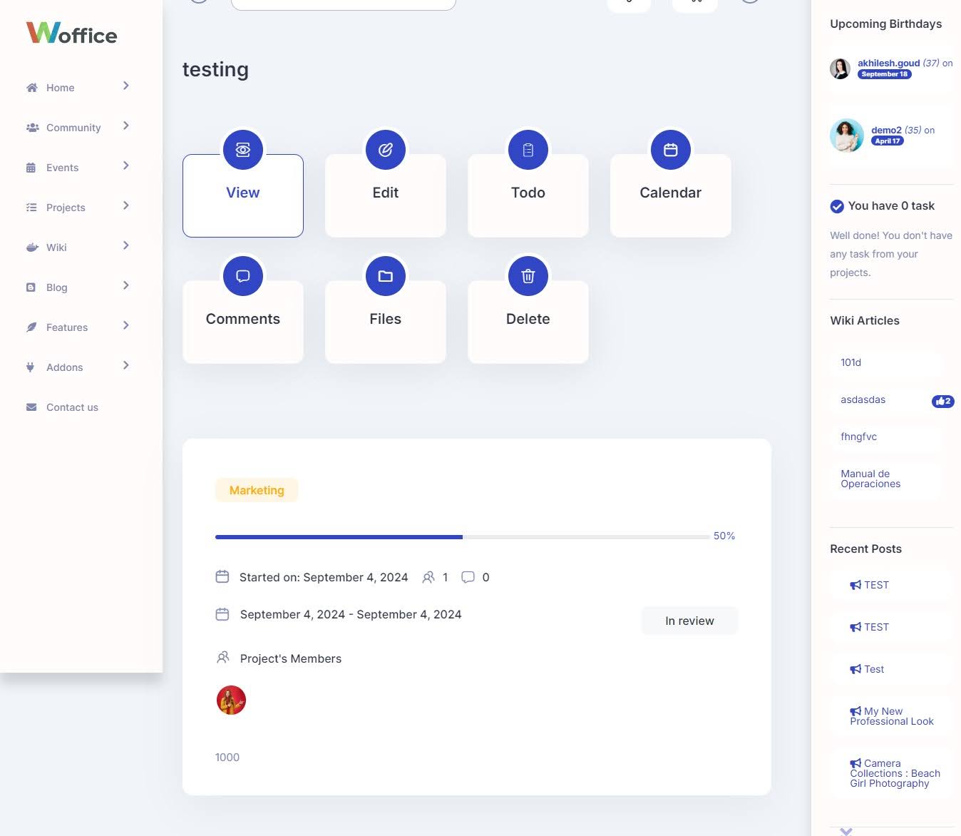
Improved Project Page Design
The Celestial design is a blend of beauty and practicality that makes interacting with your projects more enjoyable and efficient. Isn’t that wonderful?
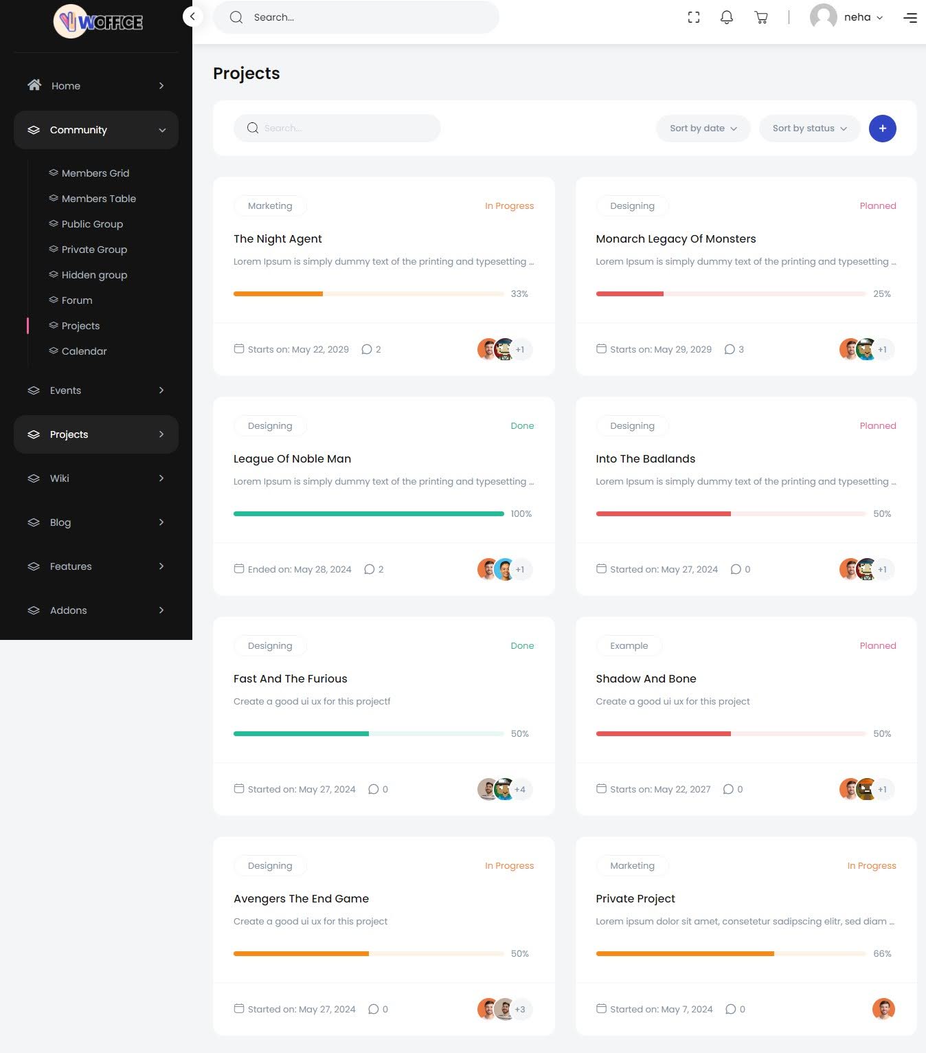
The old skin also gets the job done but it lacks the modern touch and certain other elements we’ve taken care of in the new skin.
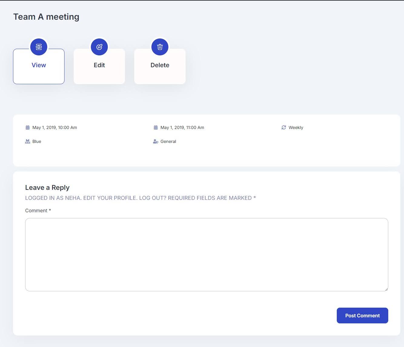
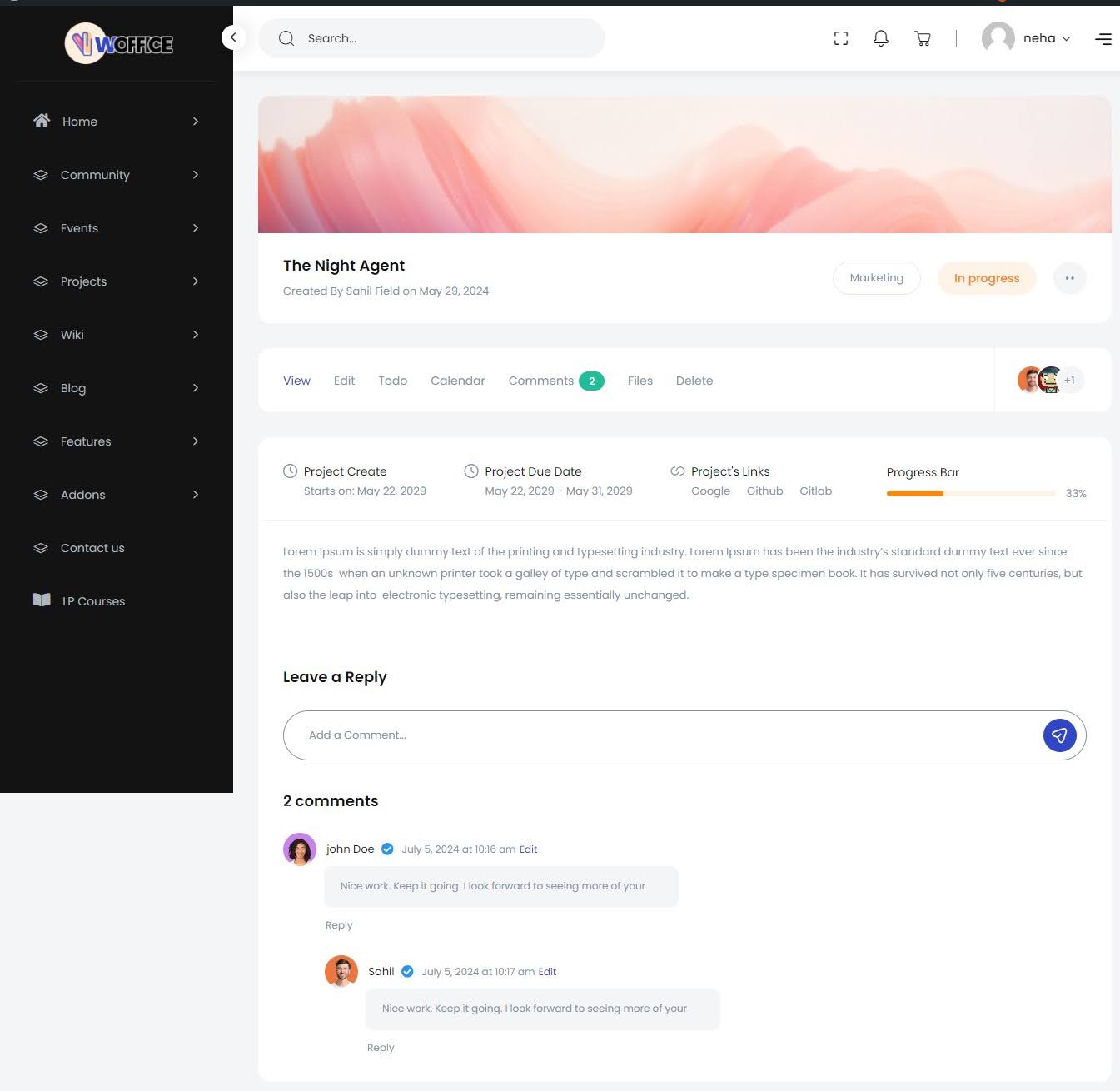
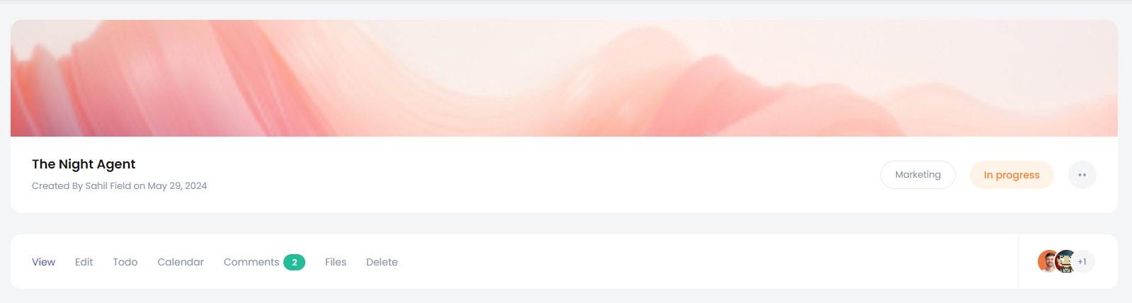
Enhanced Project Single Page
Check out the new Celestial design of project’s single page. It’s sleeker, easier to navigate, and much gentler on the eyes. We’ve made significant improvements to each tab, and seeing them side-by-side should give you a good idea of the upgrade.
Here’s the Classic skin version of the Project single page. You might find it a bit heavy on the eyes, especially after you see the updated design.
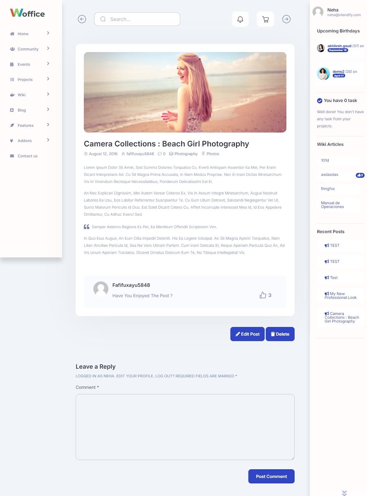
Featured Images for Projects
We highly recommend adding featured images to your projects whenever possible. A well-chosen image can give a snapshot of your project’s essence.
It also aids in creating a cohesive and polished look across your site. So, now you have the option, be sure to include a featured image to make your projects stand out!
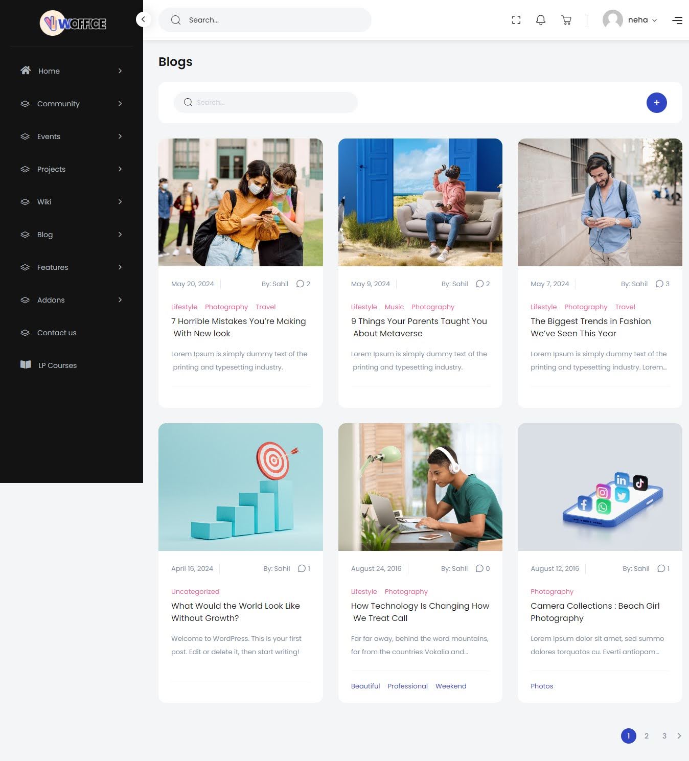
Blog Listing Page Revamp
Now, for the exciting part—check out the new skin! The updated design introduces several enhancements. Tags have been added to help categorize and find content more easily.
The layout is much smoother. Overall, the new design makes browsing through blog posts more intuitive and enjoyable.
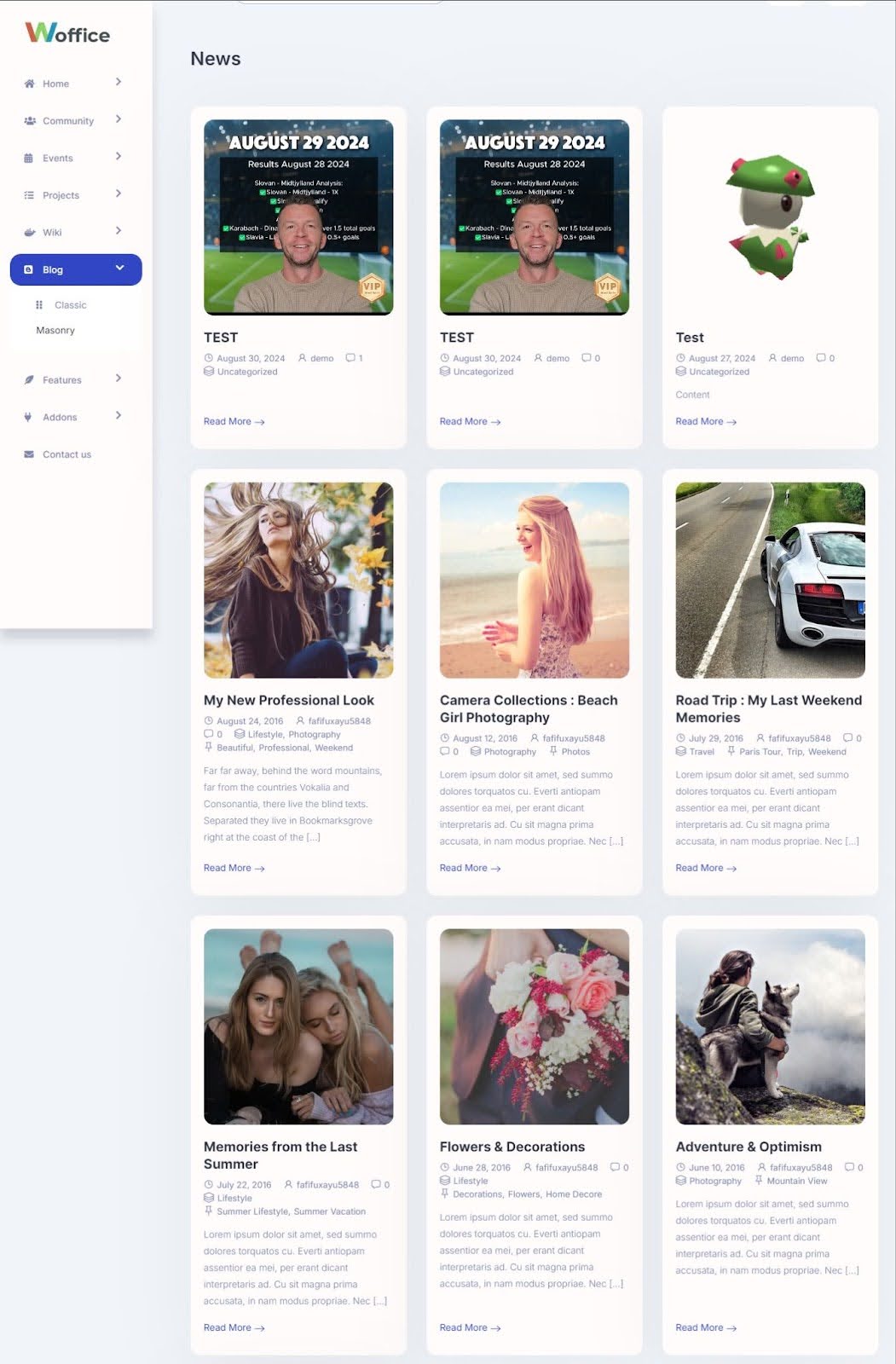
Given below is Classic skin’s blog listing layout. Navigation can feel cumbersome, and it lacks the modern elements we’ve come to expect—like tags for easy categorization or a refined structure that makes browsing effortless.
Overall, the Classic design, while functional, doesn’t offer the best user experience and feels a little dated compared to what’s possible today.
Improved Blog Single Page
As a blog writer and reader, I understand that your blog’s layout matters as much as the content itself. A good layout enhances the reader’s experience and includes elements that improve search optimization and make sharing easier.
You can now easily add or delete the post, check the author name, date, and category, making it more flexible, optimized for search, and easier to share.
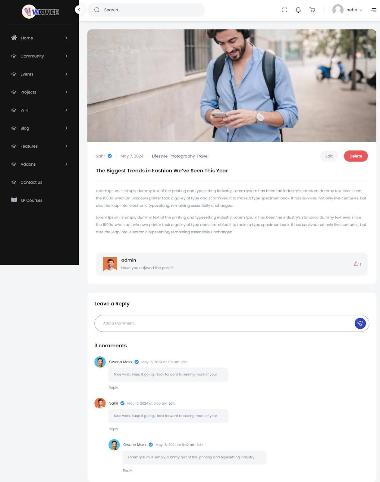
In our classic skin, these features were missing. The absence of elements like the author name, date, and category made the layout feel incomplete and less user-friendly. Additionally, the overall format appeared quite outdated, lacking the modern structure necessary to engage readers effectively.
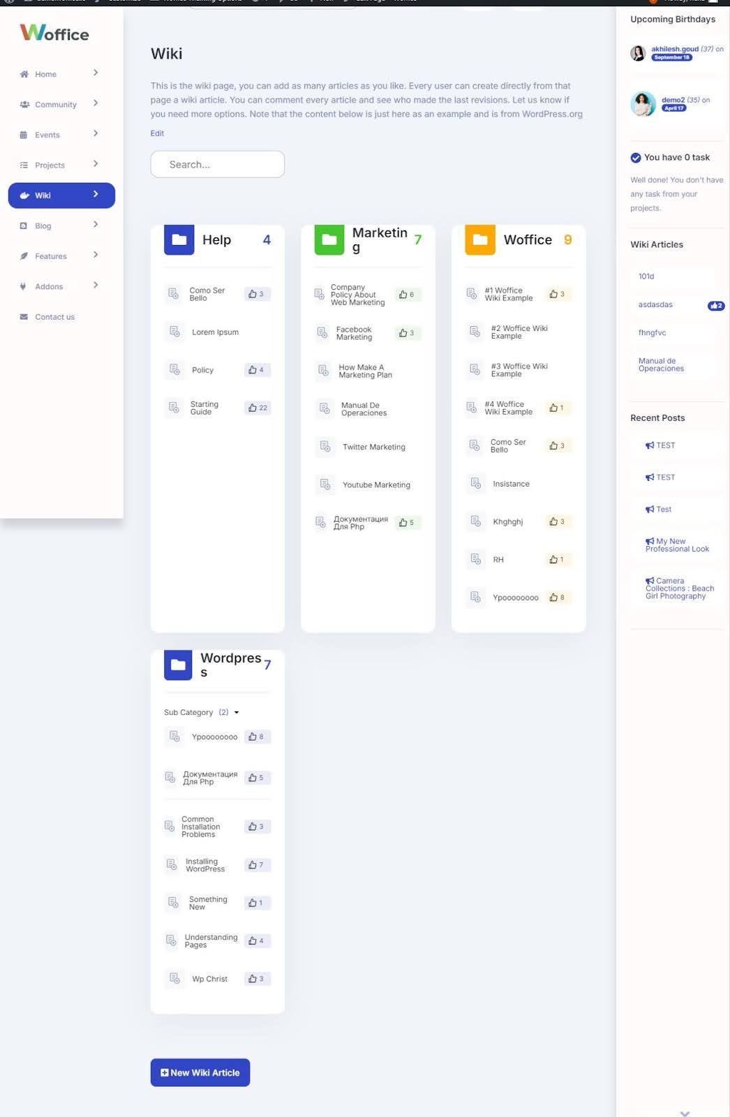
WIKI Listing Redesign
Most people are familiar with the term ‘wiki’ from popular sites like Wikipedia or Wikileaks. But wikis can also be a powerful tool for businesses to enhance internal collaboration and communication.
With our Woffice new celestial skin design, you can expect the following benefits:
- Teams can easily create and edit content together in real time.
- Each page tracks individual authors and editors, making contributions transparent.
- No need to sift through email threads; all relevant data is just a click away.
- Easy to implement and get running without technical headaches.
- A structured way to collect, store, and catalog essential company information.
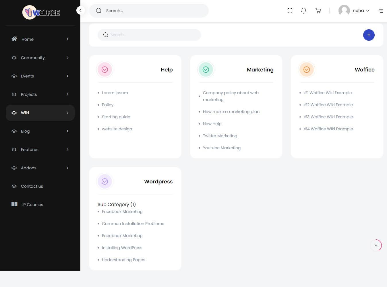
In our classic skin, the WIKI layout lacked the modern functionality and design now present in the Celestial skin. This traditional UI/UX was limited, offering a basic, outdated format where content was visible but lacked flexibility.
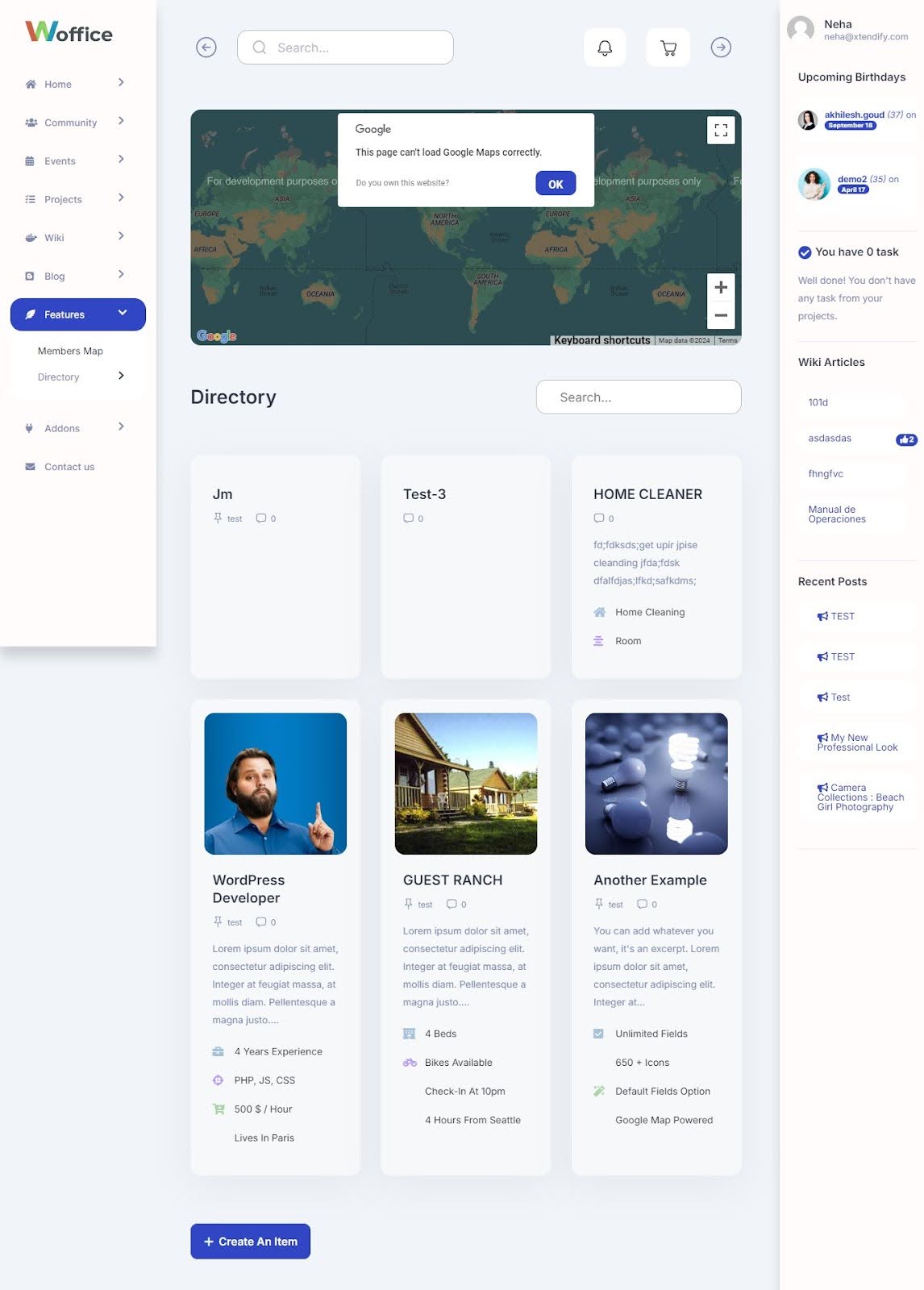
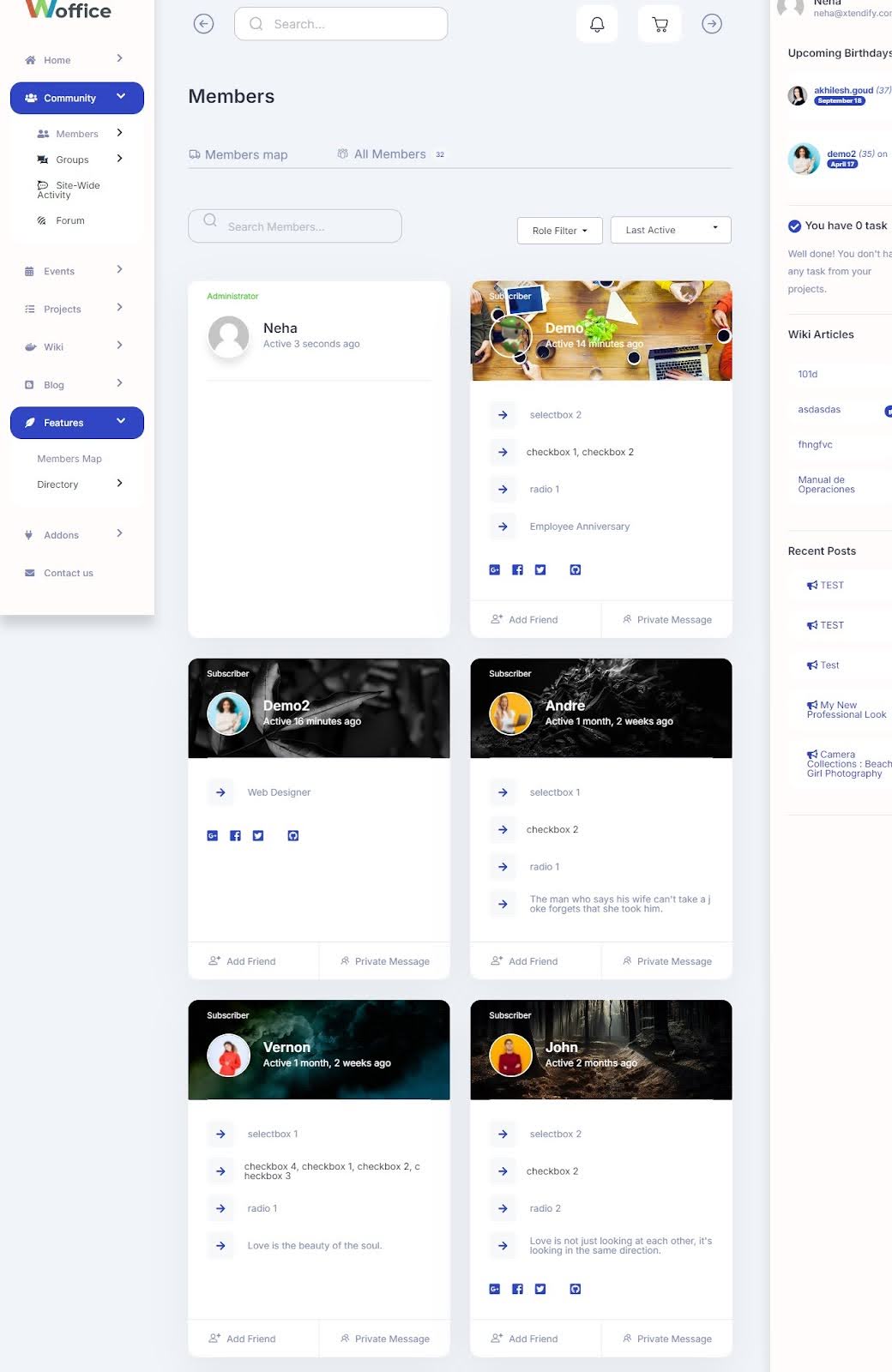
Directory Page Overhaul
Woffice’s Directory is the core of your intranet, allowing employees to easily find co-workers by expertise, skill, or department. It also provides tools to connect and collaborate efficiently.
We’ve redesigned the directory listing so that you can better connect and find suitable talent in your workplace now. This design maximizes the potential of your intranet, allowing you to collaborate more effectively and fully leverage its capabilities.
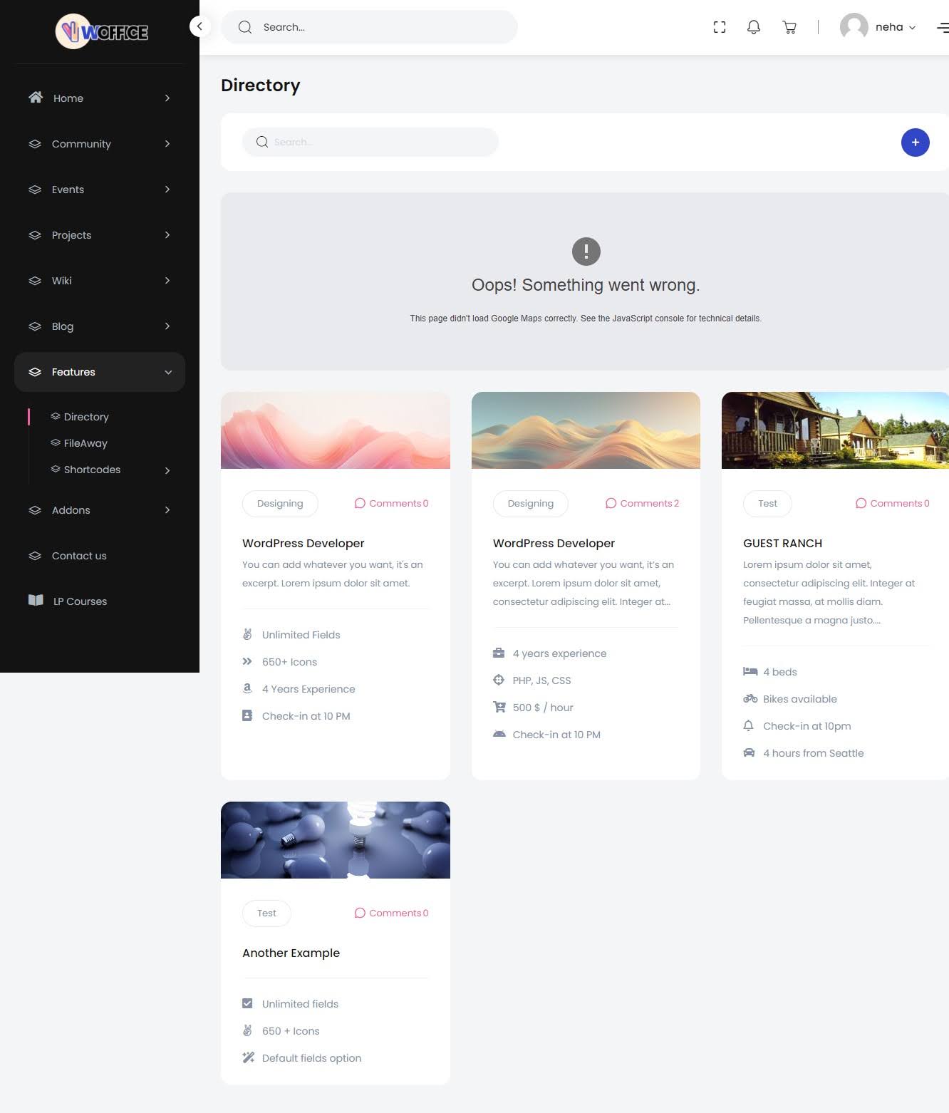
In the classic skin, the layout was functional but very basic. It allowed users to find co-workers, but the overall design was outdated. The page felt static and offers just the essentials without an intuitive flow or modern feel.
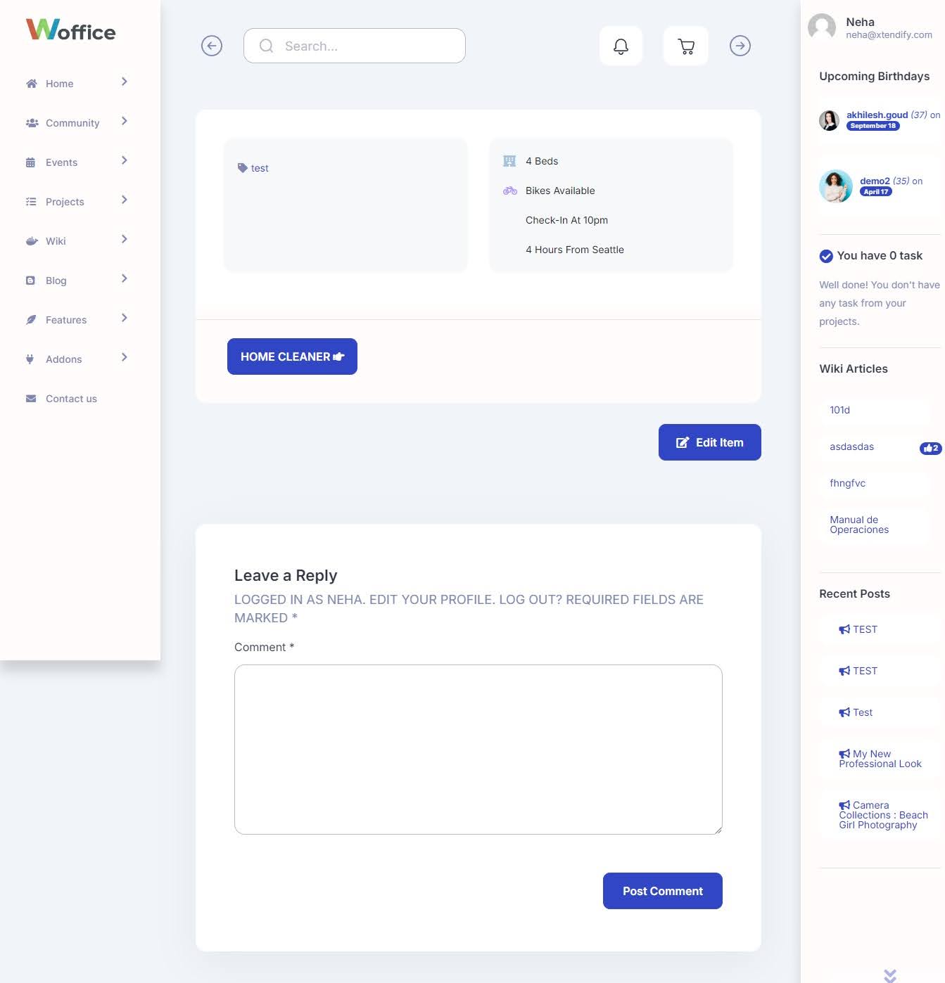
Directory Single Page Redesign
It’s no longer just a basic list of names; it’s a dynamic profile hub that helps your team get to know each other better. Each profile is easy to update and includes everything from basic details to more in-depth info like expertise, experience, interests, and even their activity on the intranet.
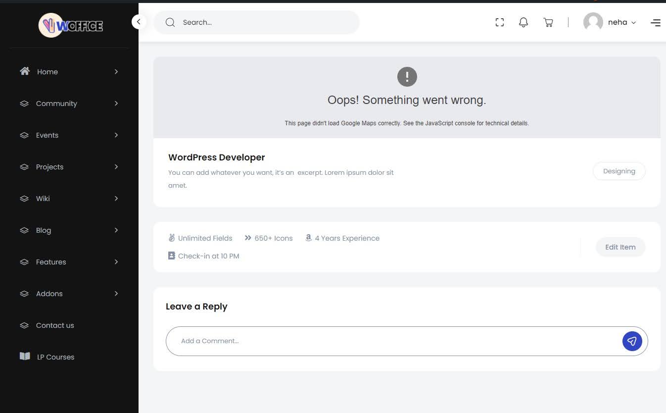
In the classic skin, the Directory single page was functional but lacked interactivity and modern design elements. The profiles were basic and static, missing the depth and engagement needed to foster a strong sense of community.
The design looked outdated, and the overall format could feel heavy on the eyes. It makes it harder for users to navigate and connect with colleagues effectively.
Community Member Listing Update
Communities on your intranet—whether called groups, online workspaces, or team sites—don’t become active and vibrant by themselves. They need careful planning and ongoing effort.
This new layout creates a space where employees with common interests can engage and collaborate with like-minded colleagues. The refreshed design offers a visually appealing and user-friendly interface, highlighting each member’s role, interests, and recent activities.
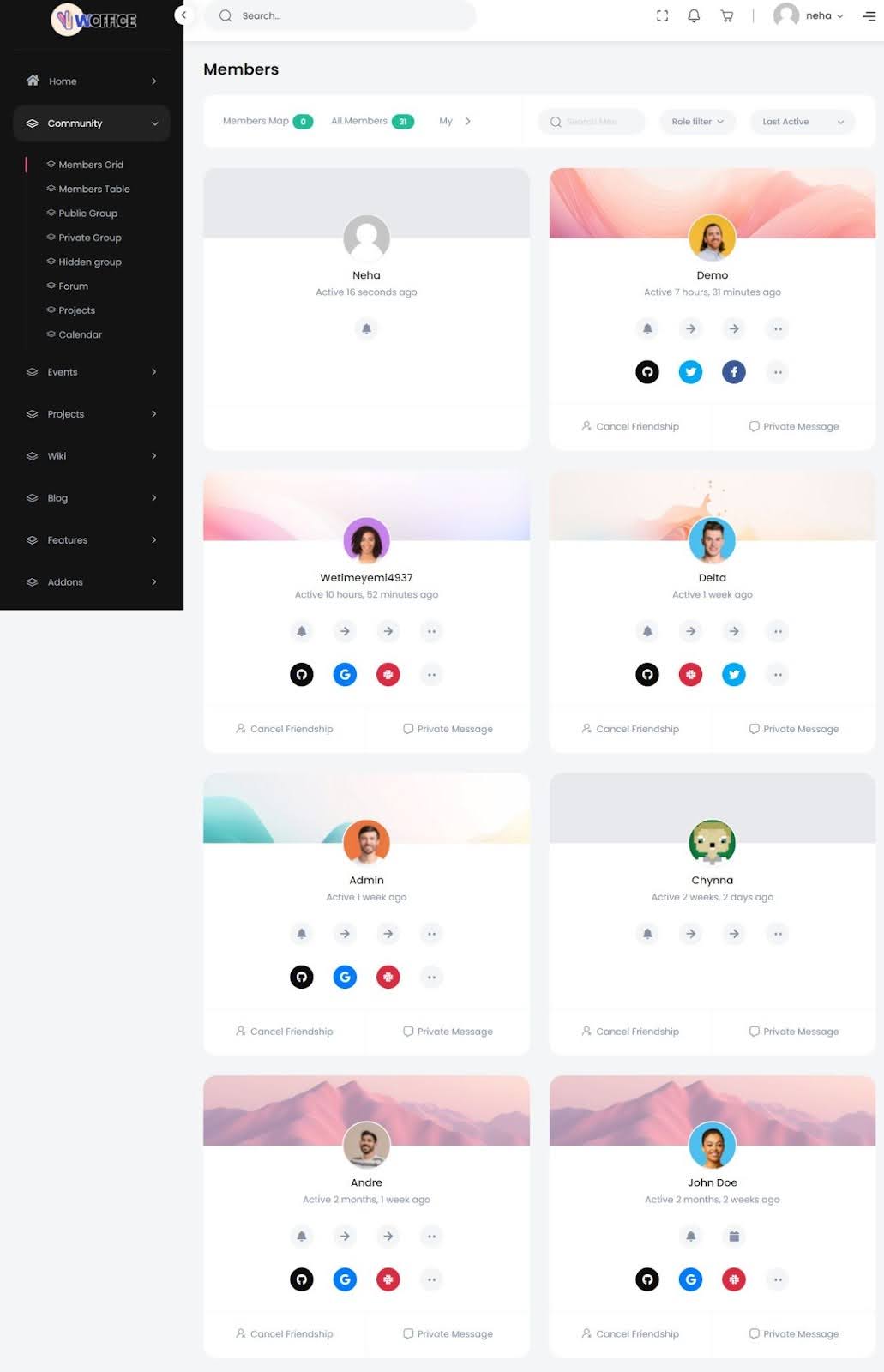
The classic skin design had its limitations. It was pretty basic, with a lot of room for improvement in terms of interactivity and visual appeal. The profiles were quite static and didn’t offer much depth. As you can see, it also lacks the modern touch that makes connecting and collaborating a breeze.
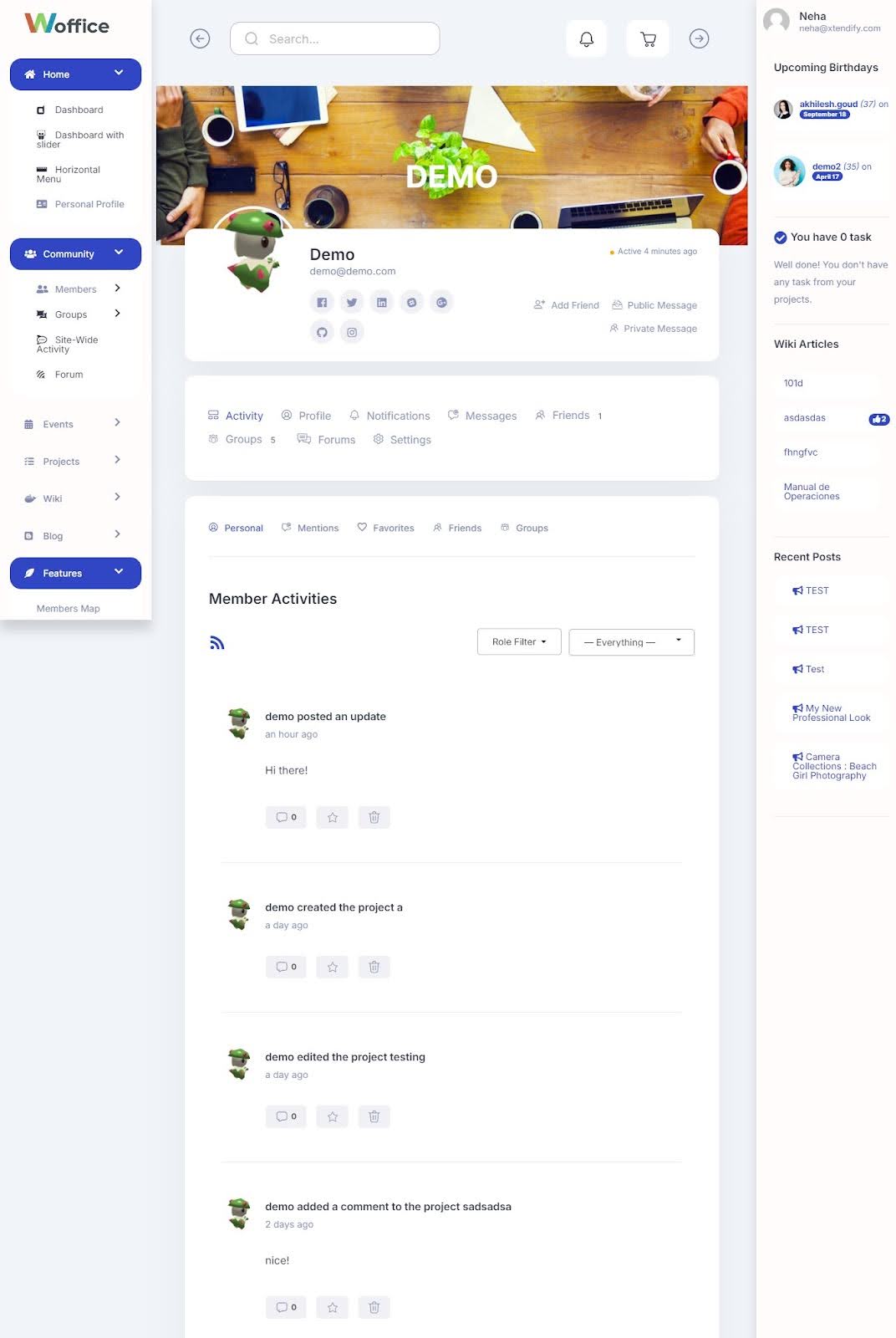
Member Single Page Redesign
With our Woffice Celestial skin, we’ve given BuddyPress a complete overhaul. The tabs are revamped, the listing view is upgraded, and the inner pages are refreshed. The new design features softer shadows that blend seamlessly with the background. It also creates a more visually appealing and modern look.
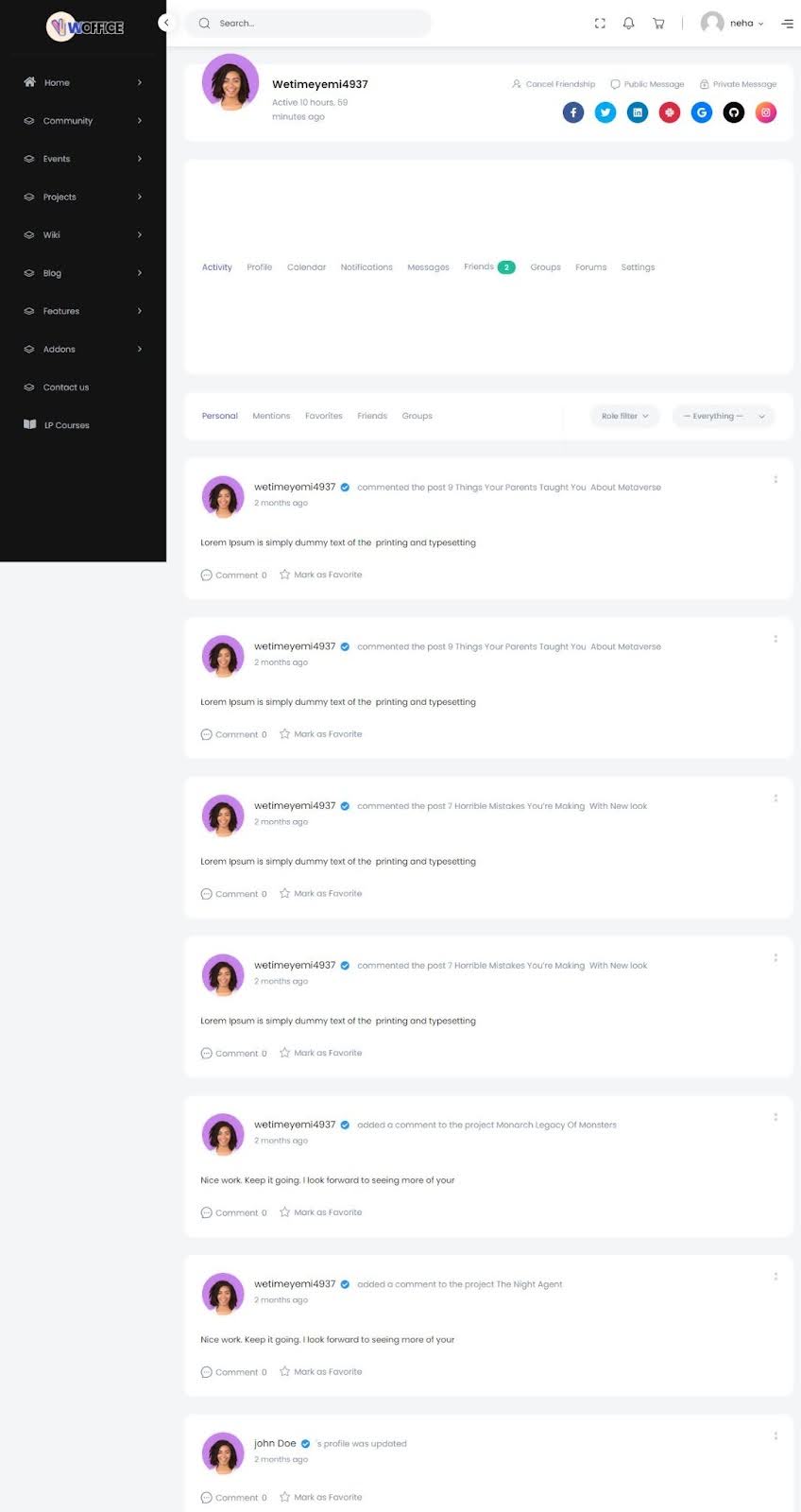
In the classic skin, the BuddyPress member pages were quite basic and lacked visual appeal. The layout was straightforward but didn’t offer much in terms of modern design or user interaction.
Now, you can say that the improvements in the classic skin are quite clear!
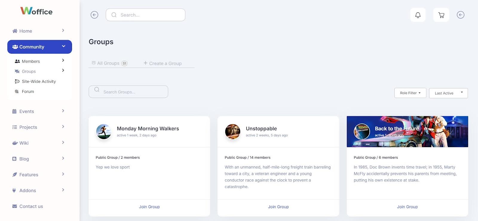
Groups Page Overhaul
At the heart of every successful business is a strong culture of collaboration and storytelling. Woffice Groups empowers you to create stories that unite people and strengthen your culture.
Check out the new design in the Woffice Celestial skin — it’s a complete update from the old layout. The new look of Groups page is sleek and modern.
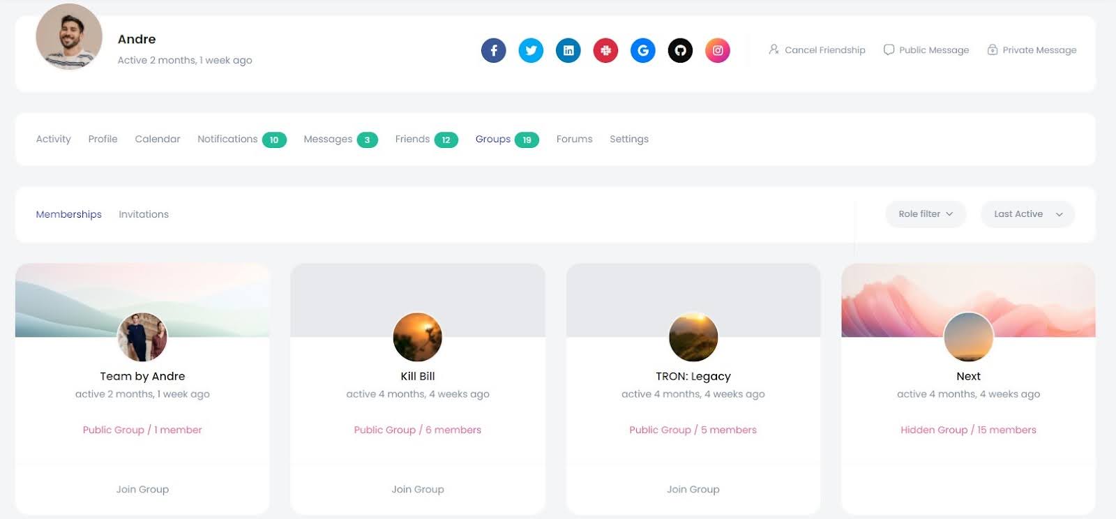
In the classic skin, the Groups section and Group single pages had their limitations. The classic layout missed the opportunity to visually capture and represent the groups and their members effectively.
We want to extend a huge thank you to the entire Woffice design and development team for their incredible hard work and for delivering the fantastic new Celestial skin.
We believe the Celestial skin is a remarkable addition to Woffice, enhancing its already powerful capabilities for building intranet and extranet communities. Whether you’re setting up your first community site or managing multiple, the new design features are going to make your experience a whole lot smoother.
Explore the new Celestial skin and see your community building efforts touching the heights!